There is a certain kind of problem that sounds trivial until you actually sit down to do it. "Recreate your app in a design tool" is one of those problems. You know your own product. You built it. You can see it right there in the browser. How hard could it possibly be to describe it to something else?
Harder than you'd think. A golf trip planner with a 6-step wizard, inline itinerary editing, a course catalogue with split-pane map, a public share page, and a design system spanning five colour palettes and two font families has a lot of surface area. Sitting down to write a prompt that captures all of that from memory, getting the hex codes right, the button labels exact, the card layouts accurate, would take longer than building the feature in the first place.
So I didn't do it from memory. I asked the thing that already knows.
The setup
Anthropic released Claude Design this week. It takes text prompts and produces visual prototypes: slides, mockups, full page layouts. You chat on the left, the canvas updates on the right. You can refine through conversation, drop in inline comments, and export to PDF, PowerPoint, HTML, or Canva.
Separately, I've been building FairwayPlan with Claude Code for the past two months. Every component, every API route, every Tailwind class, every colour token. Claude Code has read every file in the repo. It knows the design system, the copy, the layout decisions, the responsive breakpoints. It holds the full architectural context of the application in a way that I, the person who built it, honestly do not. I know the broad strokes. Claude Code knows the hex codes.
The idea was simple: use the tool that knows the codebase to write the prompts for the tool that renders visuals. Claude Code as the brief writer. Claude Design as the renderer.
Eight prompts
I asked Claude Code to generate a sequence of prompts that would, collectively, recreate FairwayPlan in Claude Design. It read the actual source files: the Tailwind config for the colour palette, the homepage components for exact copy and layout, the wizard steps for form fields and labels, the itinerary view for card structure, the course catalogue for the split-pane map interface. Then it produced eight prompts, each building on the one before.
- Design system and homepage hero. Colour palette, typography, button styles, card conventions, then the full hero section with exact headline copy, CTA buttons, date pickers, and stats row.
- Homepage sections. The three-step "how it works" grid, the featured courses section with type-coded badges, the conversion CTA, the footer.
- Trip wizard. All six steps as separate screens: dates, daily intent, region selection, preferences with sliders and toggles, affiliation radio buttons, and the review summary.
- Itinerary results. The hero banner, playing day cards with weather and clothing pills, rest day cards, trip summary, share code card.
- Course catalogue. Split-pane layout with filter bar, searchable course list, colour-coded map markers, mobile toggle between map and list views.
- Share page. The public view with its own nav, photo hero, course route map, day cards with course photos, and the "plan your own trip" CTA.
- Inline editors. The slot editor for swapping courses and the rest day editor for adding rounds back, shown in context within day cards.
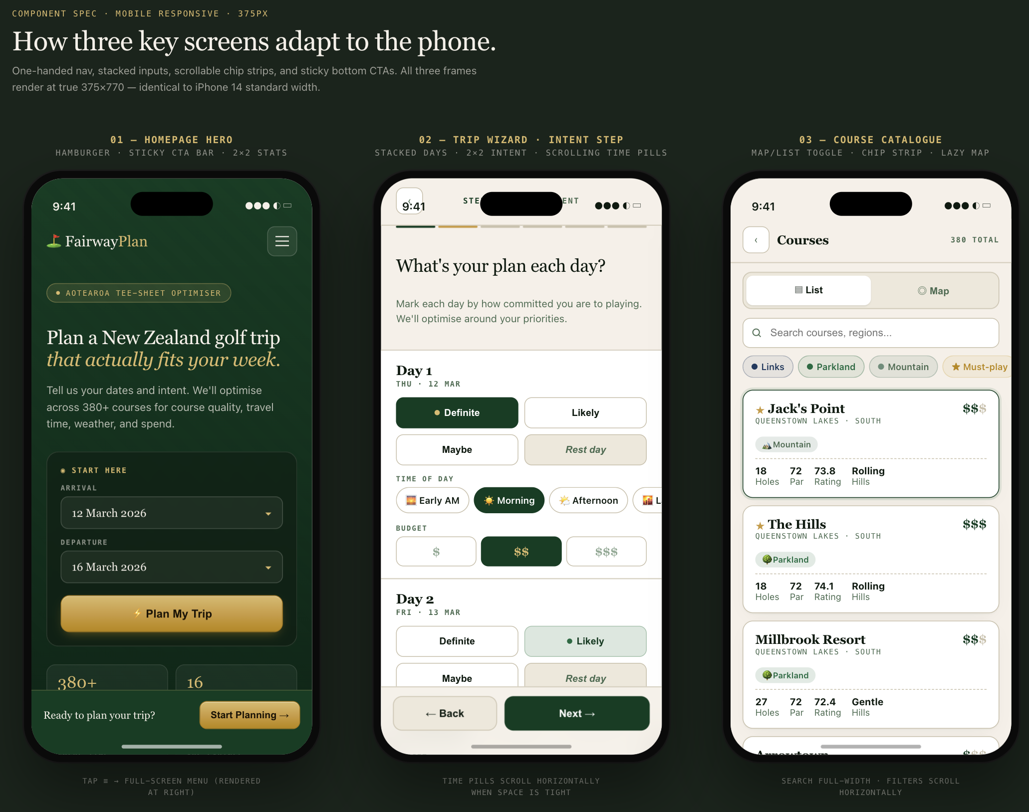
- Mobile layouts. Responsive versions of the homepage, wizard, and catalogue showing how the desktop layouts adapt at 375px.
Each prompt was detailed. The design system prompt alone specified five colour palettes with exact hex values, two font families, three button variants, and the card border style. The wizard prompt described every form field, every toggle label, every disabled state. Claude Code pulled all of this directly from the source. Nothing was approximated.
The prompts weren't generic descriptions of what the app does. They were pixel-accurate briefs written by something that had read every line of the implementation.
What Claude Design did with them
I fed the eight prompts into Claude Design in sequence. The first prompt established the design system, and every subsequent prompt inherited it. Colours stayed consistent. Typography held. Card styles matched across the wizard, the itinerary view, and the catalogue.
The interactive refinement helped. Claude Design generates adjustment sliders for things like spacing and colour, so I could tweak padding on the day cards or shift the gold accent slightly warmer without rewriting the prompt. Inline comments let me point at a specific element and say "the prestige bar should be a gradient fill, not a solid block" and have it update in place.
The result was eight screens that looked like FairwayPlan. The same colour palette, the same Georgia serif headings, the same cream backgrounds and gold CTAs. Not a rough approximation. A recognisable recreation.
This is the kind of output I could never have produced myself. I'm a data engineer. I can write a solver objective function, I can model a database schema, I can wire up Docker networking. What I cannot do is open Figma and produce three polished mobile mockups with correct spacing, a consistent type scale, and colour-coded course badges that match my Tailwind config. That skill just isn't in my hands.
Claude Code can build the app. It can write the components, set up the responsive breakpoints, get the Tailwind classes right. But it works in code. The output is a running application, not a design artefact. If I want to show someone what the mobile experience looks like before they pull out their phone, if I want to compare layouts side by side, if I want to hand a visual spec to a future collaborator, Claude Code can't produce that. It produces the thing itself, not a picture of the thing.
Claude Design filled the gap I didn't know how to fill. I pressed enter on a prompt that Claude Code had written, and a few seconds later I was looking at three mobile frames with the right fonts, the right colours, the right content hierarchy. The hamburger menu, the sticky bottom CTA bar, the horizontally scrollable filter chips on the catalogue, all of it rendered at true 375px width. I didn't draw any of it. I didn't configure any layout tool. I described what exists in the codebase and the design tool showed me what it looks like.
From design to deployable
Claude Design exports to HTML. That's the part that makes this more than a prototyping exercise.
I exported each screen as HTML and brought the assets back into the FairwayPlan repo. The goal was to make these available as a sideloadable pathway: a parallel set of static pages that sit alongside the live application, accessible at their own route. Think of it as a design showcase, or a preview build, or a clickable prototype that lives inside the production deployment rather than in a separate Figma link that nobody opens twice.
I'll be honest: the first export was rough. The spacing wasn't quite right in places, a few elements didn't line up the way they do in the actual app, and some of the finer details, the prestige bar gradient, the exact border radius on the course type badges, needed manual adjustment. It wasn't a drop-in replacement for production code. It was a starting point.
But that's the thing about starting points. Before this, I didn't have one. I had a running application and no design documentation at all. No mockups, no visual specs, no reference screens. Getting from zero to "rough but recognisable" in an afternoon, where my main contribution was pressing Enter to approve the prompts Claude Code had written, is a trade I'll take. I can refine from here. I can iterate on individual screens, tighten the spacing, fix the details. The hard part, going from nothing to something that captures the full scope of the app visually, that part is done.
Two hours of work where I mostly pressed Enter. The result needs polish. But it exists, and before this week it didn't.
The sideloading approach means the design artefacts travel with the codebase. They share the same deployment pipeline. They sit under the same domain. When someone on the team wants to reference the intended design for a screen, they don't need access to a third-party tool. They open a URL.
Why the brief matters more than the tool
You could write these prompts by hand. Open your Tailwind config, copy the colour tokens, walk through each component, note down every label and layout decision, and assemble it into a structured brief. It would take a few hours and you'd almost certainly miss things. A border colour here, a hover state there, the exact wording of a subheading you wrote three months ago.
The value of having Claude Code write the brief is completeness. It doesn't forget hex codes. It doesn't paraphrase button labels. It reads the actualtailwind.config.ts and reports #c89a3e, not "a sort of goldy colour." It reads TripWizard.tsx and reports the exact step names, form fields, and disabled states. The brief is as accurate as the source code, because it was generated from the source code.
This matters for design consistency. If your design tool is working from an approximate description, the output will be approximately right. If it's working from an exact specification, the output matches what you actually built. The gap between "design" and "implementation" shrinks when both are reading from the same source of truth.
What the UX skill couldn't do
Before Claude Design existed, I had a UX design skill wired into Claude Code. It thinks like a designer. It knows the FairwayPlan colour palette, the component patterns, the typography rules, the mobile breakpoints. When I asked it to review a layout or suggest improvements, it would come back with specific, grounded recommendations: "increase the touch target to 44px," "swap the sand accent for navy on the links badge," "the green fee should be right-aligned serif, visually heavier than the course stats below it."
All text. Every single recommendation was a description of what to change, not a picture of the result. The only way to see whether the suggestion actually worked was to implement it in code, rebuild the container, reload the browser, and squint at the screen. If it looked wrong, I'd go back to the conversation, describe what felt off, get another text recommendation, implement that, rebuild, reload, squint again. The feedback loop had a code change and a Docker build sitting in the middle of every iteration.
That loop was fine for incremental polish. Adjusting padding on an existing card, fixing a contrast issue, tweaking a hover state. Small, safe changes where the text description was enough to act on with confidence.
Where it fell apart was anything ambitious. I wanted to explore what the share page would look like with course photos in the day cards. I wanted to see whether the wizard's intent step would work better as a compact grid or a full-width row per day. I wanted to compare three different hero layouts side by side. These are visual questions. Answering them in text is like describing a painting over the phone: technically possible, practically useless.
The UX skill could tell me what to build. It could not show me what it would look like. That's the gap Claude Design fills.
Claude Design made those explorations fast. I could ask "show me the share page hero with a full-bleed course photo and the stats overlaid at the bottom" and see it in seconds. If the overlay killed the text contrast, I could see that immediately and adjust, instead of implementing it, discovering the problem in the browser, and rolling it back. The iteration cycle went from minutes to seconds, and the number of ideas I could explore in an hour went from three or four to twenty.
The UX skill is still valuable. It catches accessibility issues, flags contrast ratios, thinks about keyboard navigation, and knows the existing component inventory well enough to suggest the minimal code change for a given design goal. Those are things Claude Design doesn't do. The two tools complement each other: one thinks about design in code terms, the other shows you what the code would look like before you write it.
The workflow, concretely
For anyone who wants to try this with their own project, here's the actual sequence:
- Open Claude Code in your project directory. It already has context on your codebase from the CLAUDE.md and from reading files during prior sessions.
- Ask it to generate Claude Design prompts for your app. Be specific about what you want covered: "Generate 5 prompts for Claude Design that recreate the homepage, the main user flow, and the settings page. Pull exact colours from the Tailwind config and exact copy from the components."
- Review the prompts. They'll be long and detailed. That's the point. Check that the hex codes match, the labels are right, and the layout descriptions reflect what you actually built.
- Feed them into Claude Design sequentially. Start with the design system prompt so the visual language is established before you add screens.
- Refine in Claude Design using inline comments and the adjustment sliders. The prompts get you 90% of the way. The last 10% is conversational.
- Export as HTML and bring the assets into your repo as a sideloadable route.
Claude Code writes the brief. Claude Design renders it. You review both. The whole cycle took an afternoon.
What this is and what it isn't
This is not a replacement for a designer. A designer would look at these screens and immediately see things to improve: spacing rhythm, visual hierarchy, interaction patterns that make sense as static mockups but fall apart under real use. Claude Design is fast and accurate, but it optimises for fidelity to the prompt, not for the thousand small judgment calls that make a UI feel right.
What it is: a way to get from "working code" to "visual documentation of that working code" in a fraction of the time it would normally take. For a solo developer on a side project, that's the gap that never gets filled. You build the thing, you ship the thing, and the design artefacts never exist because there was never a design phase. The design was whatever came out of the code.
Now the design artefacts can be generated after the fact, from the code itself, and they're accurate because they were written by something that read the code. That's a new capability. I'm still working out what to do with it.
Two tools, one context
The interesting thing here isn't either tool in isolation. Claude Code is a terminal-based coding assistant. Claude Design is a visual prototyping tool. Neither one does what I described on its own. The useful part is the handoff: code context flowing into design prompts flowing into visual output flowing back into the repo.
FairwayPlan now has a complete set of design screens that match the production app, generated in an afternoon, living inside the codebase. The next time I make a significant UI change, I can regenerate the affected screens by asking Claude Code to update the relevant prompts and running them through Claude Design again.
It's a loop. Code informs design. Design lives alongside code. Changes to one propagate to the other through the same prompt pipeline. For a one-person team building a golf trip planner in the evenings, that's a workflow I didn't expect to have.