A few weeks ago I decided to run an experiment on the FairwayPlan homepage. Three variants. The original design, dark forest green with gold accents and the luxury aesthetic I'd been refining since launch, served as the control. Two challenger variants were built from scratch. In previous roles I'd sat in the room when tests like this were planned. I'd built the dashboards, computed the confidence intervals, told the team whether the lift was real. But I had never been the one designing the variants. I wanted to see how far I could push that side of it solo, with Claude doing the heavy lifting on execution.
I built all three. Wired up Umami event tracking. Assigned visitors randomly. Let it run. Then I looked at the numbers and learned approximately nothing about which homepage works best.
I did learn something else, though.
The three variants
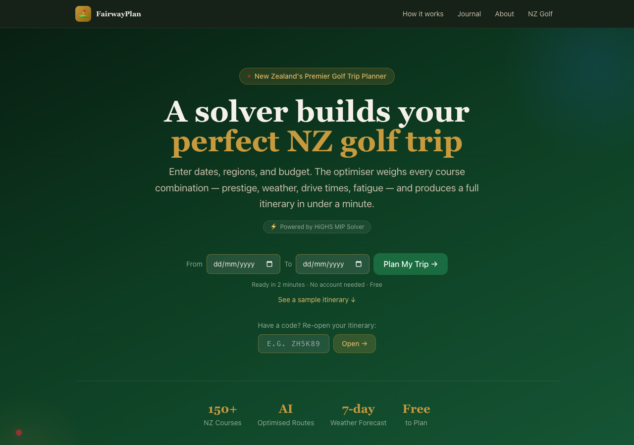
Variant A was the existing homepage. The one described in my earlier post about the colour palette: championship greens, Wada Sanzo's colour theory, the whole bit. It had been through several rounds of refinement. I understood why every element was there and what job it was doing.
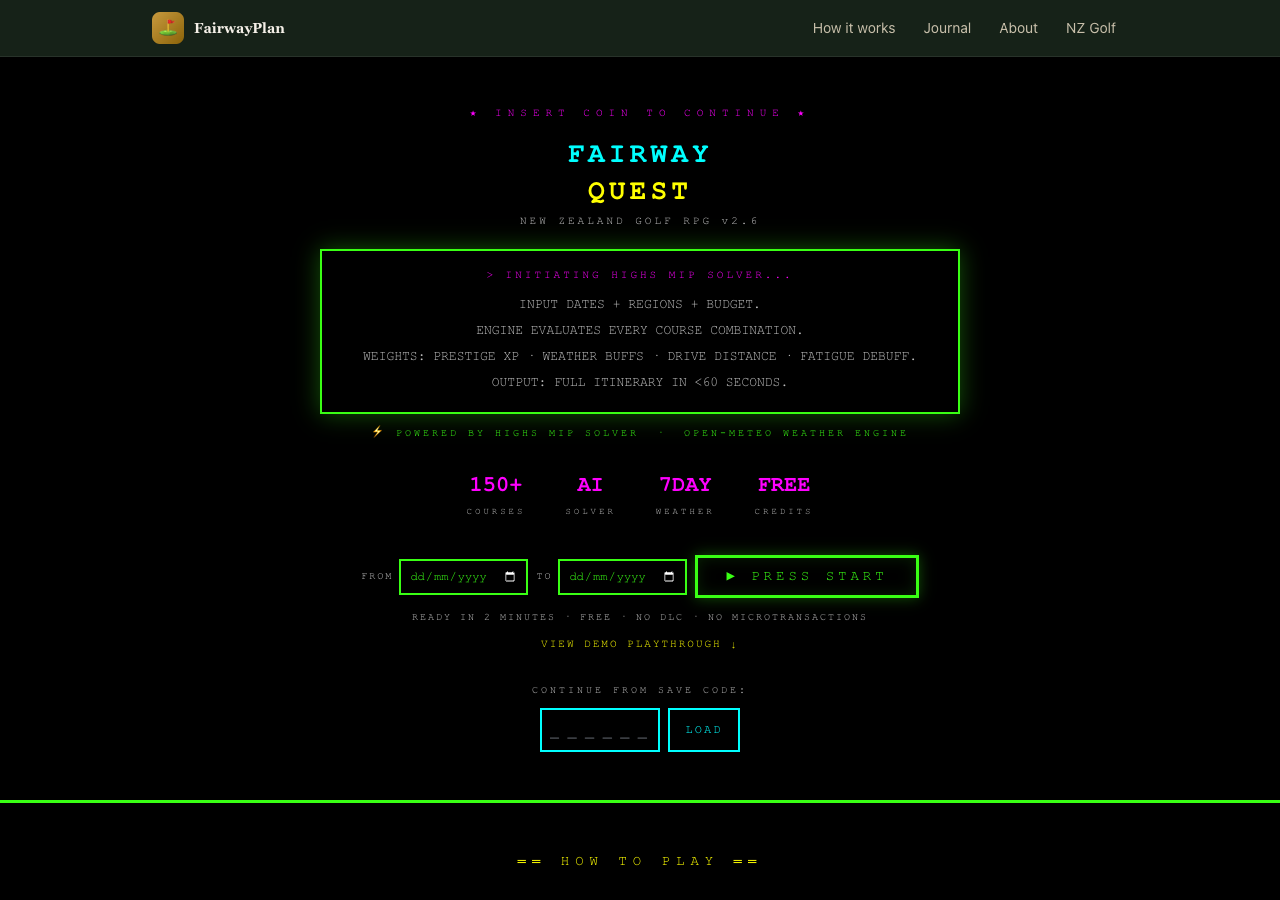
Variant B was an 8-bit retro theme. Monospace font, neon green on black, game-like UI elements. “INSERT COIN TO CONTINUE” instead of a call to action. Course stats displayed like RPG character sheets. The idea was that golf planning is basically a strategy game (pick your loadout, optimise your build, go) and maybe leaning into that would resonate with a certain kind of visitor.
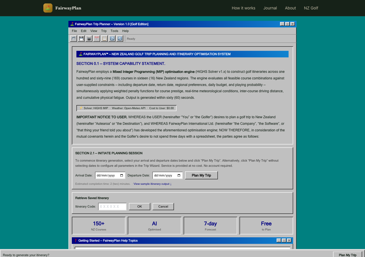
Variant C was a Windows 95 parody. Beveled surfaces, MS Sans Serif, dialog boxes with title bars, a fake taskbar at the bottom with a system clock. Course data in HTML tables. The entire thing framed as a legal document with absurd formal sections. The idea was that humour and nostalgia might hold attention longer than polish.
On paper, this is a reasonable experiment. Three meaningfully different creative directions. Enough contrast to produce a signal if one exists. The tracking was clean: exposure events on page load, conversion events on itinerary generation, share actions, booking link clicks. Everything tagged by variant.
The data said almost nothing
The sample was tiny. A handful of sessions across each variant. Not enough to run a meaningful statistical test, not enough to identify a trend, not even enough to tell me whether the differences I was seeing were signal or just noise from a small denominator. The spread across variants was roughly even, with no dramatic winner and no obvious loser, which at this sample size tells you precisely nothing.
A proper A/B test needs hundreds or thousands of sessions per variant before you can draw conclusions. I knew this going in. I did it anyway because setting up the infrastructure seemed like a useful exercise regardless of whether the numbers converged.
The infrastructure was useful. The experiment was not. I killed it and put everyone back on variant A.
The real problem was upstream of the data
Here is the part I have been thinking about since. The reason the experiment failed is not that the sample was too small. That was a known limitation. The reason is that variants B and C were not good enough to deserve a real test.
The retro theme was fun to look at for about ten seconds. After that it was hard to read, hard to navigate, and hard to take seriously as a tool you would trust with your actual golf trip. The Windows 95 theme was funny in a screenshot and exhausting in use. Neither variant had a clear theory of persuasion beyond novelty. They were aesthetic exercises, not design hypotheses.
And the reason they ended up that way is that I was working outside my domain. As I mentioned, I have been around this process before. But I was always on the measurement side of the table, not the creative side. I understood what made a test valid. I never had to understand what made a variant good.
That distinction did not feel important until I tried to cross it. Designing a homepage that converts, understanding why someone who has never heard of your product should stay instead of bouncing, understanding the psychology of a first impression, understanding what “trust” looks like in a layout: that is a whole different realm from measuring whether a test reached significance. Sitting next to designers does not make you a designer any more than sitting next to the pilot makes you qualified to land the plane.
I used Claude to build the variants. And Claude did exactly what I asked: it produced three visually distinct homepages, each internally consistent, each technically functional. The code was clean, the components were well-structured, the Umami integration worked perfectly. But the brief was wrong. I was asking for creative directions without understanding the principles that make a creative direction effective. The AI executed faithfully on a prompt that was missing the most important ingredient: domain knowledge I did not have.
You cannot prompt your way past a gap in understanding. The AI will give you exactly what you ask for. If what you ask for is wrong, you get a very well-built wrong thing.
Where the workflow breaks down
Most of my experience with AI-assisted development has been in areas where I have strong domain knowledge. The MIP solver: I understood the objective function, the constraints, the trade-offs. The weather pipeline: I knew the data sources and the caching tiers. The share page: I knew what information needed to be on it and how it needed to flow. In each case the AI accelerated work I already understood. I was a competent reviewer because I knew what good looked like.
The homepage experiment was different. I was not a competent reviewer of homepage design. I could tell whether the code worked. I could not tell whether the design would work. I did not know what questions to ask, what principles to apply, what a conversion-focused designer would have flagged in the first five seconds of looking at variant B.
This is the gap that does not get discussed enough in the AI workflow conversation. The tooling is extraordinary. Claude Code can produce a complete, themed, component-based homepage in a single session. But the quality ceiling is set by the person writing the prompt, and when that person is operating outside their expertise, the ceiling is low. The tool is not the limitation. The brief is.
What I should have done
Read more before building. Spent a week with actual conversion rate optimisation material, not the blog posts that tell you to make the button bigger, but the research on cognitive load, visual hierarchy, trust signals in unfamiliar product contexts. Talked to someone who designs landing pages for a living and asked them what they would test on a site like this.
The experiment should have started with research, not code. I skipped straight to building because building is what I know how to do and what the tools make easy. That is a trap. When you have a hammer that can produce entire React applications in twenty minutes, everything looks like a component.
The right workflow for unfamiliar domains is slower than what I did. It looks more like: read the basics, talk to a specialist, form a hypothesis that is grounded in something other than “what if it looked different,” then build the variant that tests that specific hypothesis, then run the test. The AI fits into steps four and five. It does not replace steps one through three.
The human element
I have written several posts now about how AI workflows have accelerated this project. Parallel agents, automated integration, a full-stack app built in compressed timeframes. All of that is real and I stand by it. But this post is the other side. The part where a human who does not know enough about a domain tries to substitute speed for understanding, and the result is technically impressive and practically useless.
The variants are still in the codebase. You can append ?variant=B or ?variant=C to the homepage URL if you want to see them. They are amusing. They are not good homepage designs.
And that is fine. The point of running experiments is that some of them fail. The useful failures are the ones that teach you something about the process, not just the outcome. This one taught me that the AI workflow I have been developing over the past month has a specific shape: it works brilliantly when I bring the domain knowledge and the AI brings the execution speed. It falls over when I try to have the AI supply both.
The tool is not the bottleneck. The brief is the bottleneck. And the brief is only as good as the person writing it.
Next time I want to test something outside my expertise, I will do the reading first. Or find the person who already has. The AI will still be there when I get back, ready to build whatever I ask for, at a speed that continues to be slightly unnerving. The hard part was never the building. It was knowing what to build.